
This is a quick guide to the user interface of the App.
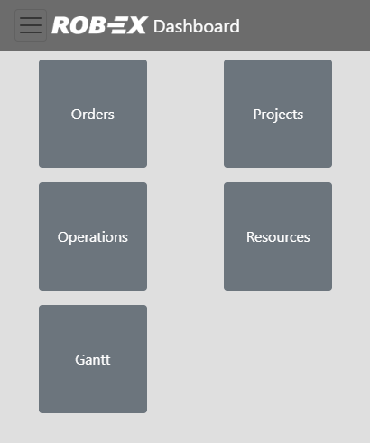
The home screen
From this screen, you can jump to different KPI areas.
- Orders – e.g. Scheduled Order delivery performance
- Projects – e.g. Scheduled Project delivery performance.
- Operations – e.g. Scheduled Operation delivery performance
- Resources – e.g. available vs. scheduled capacity per week per resource area (work center area)
- Gantt – show Gantt charts for selected resources
Clicking on the top logo (or the  button) will take you back to the home screen.
The Orders KPI area
Each KPI area starts with an overview showing miniature graphs of all available KPIs
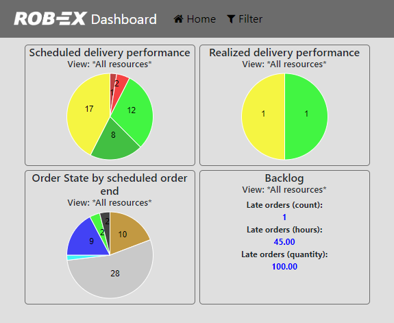
Clicking the miniature graphs will give you more detail. As an example, this will be shown if you click the “Scheduled delivery performance” miniature.
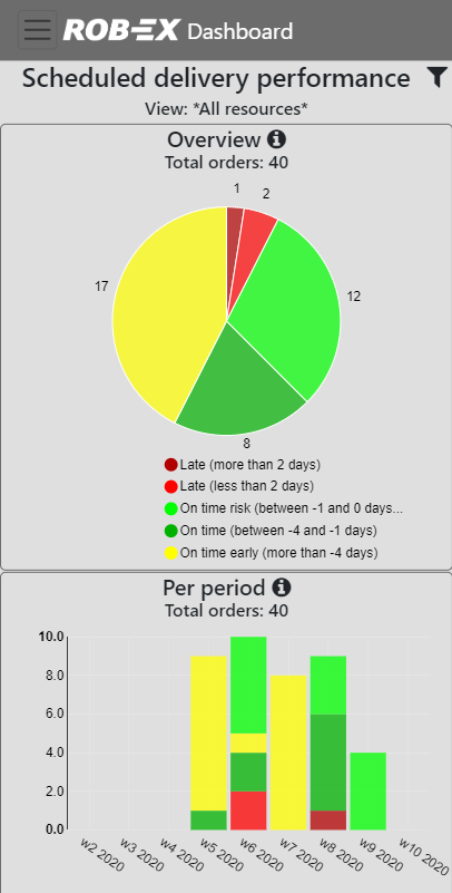
Click the  button for more details about what you see.
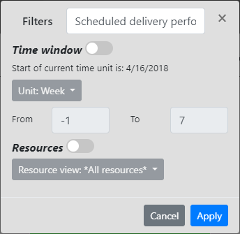
Click the filter button ![]() to view or change the name of the KPI, the time period being analyzed and what resources it looks at. Note that by default all filters inherit the global filter settings edited in the home menu: “Filter”
to view or change the name of the KPI, the time period being analyzed and what resources it looks at. Note that by default all filters inherit the global filter settings edited in the home menu: “Filter”
The Resource KPI area
This area shows user selected resource graphs. The graphs shows available hours and booked hours.
- Available hours
- The source is the resource shift calendar. Visualized as a line graph
- Booked hours
- The source is either scheduled outstanding work or actual daily work (history based). A single graph can show either way bot not both at the same time. History based graphs relies on the recording and aggregation carried out by the resource monitor macro OperationProgressTracking.
The resources contributing to a graph is related to a specified resource view. The board type the graph belongs to, decides how a resource view is presented. The default board is the “Flow” type. Additional boards are added using the Add board menu option.
Flow board
The Flow type board is the default board used. Graphs are added one after the other according to the window space available. On a mobile client graphs may show like shown below in a single column, on a Desktop browser they may be shown in e.g. 3 columns. Each graph shows an aggregated view of the selected resource view. As an example if a resource view contains two resources, then available and booked hours are the sum of the two resources.
The following view shows 3 different graphs. By default only a single graph is added. Add additional graphs using the New graph option of the board menu.

The individual graph is configured to suit your needs by opening the filter ![]() of each graph and change:
of each graph and change:
- The graph name.
- The time window and resolution (day, week, month).
- The resources analyzed.
- Choice between showing scheduled outstanding work (the default) or historic data based on the resource monitor macro OperationProgressTracking.
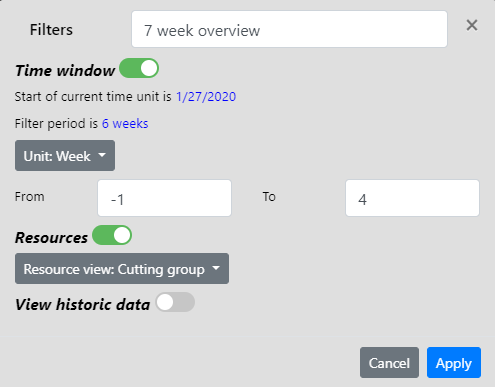
As an example, the following configuration customizes a 7 week overview graph, to show available and scheduled workload one week ahead of now (-1) and 4 weeks forward from now (4)
The resources are limited by the global resource views pre-configured by the planner (local user views are not included). In this case the Cutting group view.
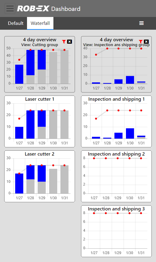
Waterfall board
The Waterfall board type will add each graph on a single top row. The top row graph shows the same information as a board added to a Flow board. The dashboard app will now automatically unfold the top row graph, and show a new graph for each of the members of the resource view. As an example if a resource view contains two resources R1 and R2, then the top row graph shows the aggregated information. Two additional graphs, one for R1 and one for R2, are now automatically shown, with the individual contributions of R1 and R2.
Use waterfall boards when you need the full understanding of each individual resource. Also another useful way to use a waterfall board, is by adding the same resource view twice, but with the twist that the first graph is configured to show historic data. This way you can easily compare both history and future for an entire resource view (i.e. very often a break down in the history explains an overbooking in the future).
The example below shows a waterfall board with two graphs added. Notice how the first graphs is for resource view Cutting group with two members. The other graph is for Inspection and shipping group with three members (notice how this reveals that all work is assigned to Inspection and shipping 1 and nothing to the two other members)
The Gantt area
Shows one or more read-only Gantt charts.
- Click the New button to add a new Gantt chart
- Select the Gantt chart, then edit the filter icon to manage
- What resource view to show
- Resolution: days, weeks, months
- Horizon to show
- Color mode: order, operation status, route, material shortage
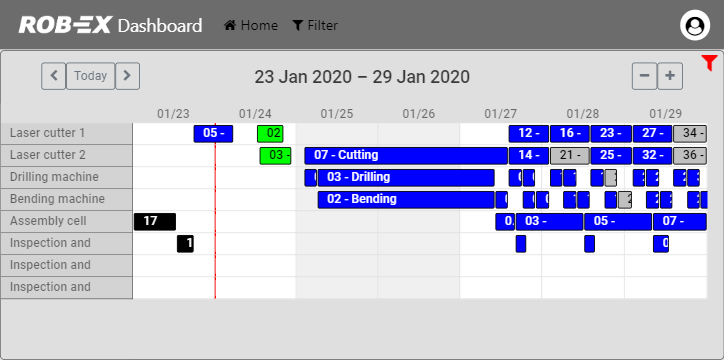
Use the navigation buttons above the Gantt chart to change horizon and start time of the view.
Double click an operation in the Gantt chart to view details. The actual content of the detail window is configurable, please refer to the configuration section.
Post your comment on this topic.